UX Design Process: How To Create A User-Friendly Interface

Analyst
Reading time: 11 minutes
Hello, I am Irina, an analyst at Azoft. During my career at Azoft, I collected and analyzed user requirements for projects such as a start-up for the selection of housing for pensioners in the field of social security (US), a start-up for software development for management companies (UK), a SaaS platform called iFarm Growtune for farm management (Russia) and many others. In each of these projects, at the analytic stage, the main challenge lies in creating screen prototypes. In this article, I will share our approach to completing this task.
Why businesses need UX design
UX means user experience, the result of user interactions with the interface. Interactions should be intuitive and consistent with behavior patterns, and interface solutions should be consistent.
We, as users, do a lot of online activities without thinking. We perceive some sites easily, while others make us want to “run away,” because nothing is clear, and with every click, we have to think about things such as: “where will it take me?” or “where is the return button?”
However, with a well-thought-out structure and the usual arrangement of the main visual elements, it is possible to facilitate the user’s interaction with the site or app and not distract him from the target actions. Smart product design allows users with different capabilities to successfully use digital products, such as websites and apps.
Let’s take a look at some core benefits of investing in UX design.
Build engaging the customer journey
Creating a comprehensive customer journey map is a good way to better understand what real users will encounter when using your service. It will also allow you to fix the interface elements that don’t work well, are difficult to navigate and see how to make the entire experience more satisfying.
A well-thought-out UX helps end users to reach their destination and complete their goals. If your app lacks direct navigation, a clean layout, a clear description of products, and appealing calls to action, you’ll be likely to lose your customers to your competitors. On the contrary, a smooth customer journey stimulate clients to end up buying your products.
Improve ROI
Investing in UX can improve the ROI in five areas:
- Boosted overall revenue/conversion. Ease of use and emotional attachment to the brand result in customer loyalty.
- Increased customer satisfaction. Customers enjoy well-designed apps and websites that give them what they need and want (and what they don’t know they need and want)
- Lower support calls. UX allows pre-empting common usability problems which lower the company’s costs.
- Reduced development waste. Correcting a problem at the development stage is far more expensive than fixing the same problem during the user-centered design phase.
- Reduced risk of building the wrong thing. User research is a tool to find out what your customers will find to be the most usable and valuable things.
The Design Management Institute, for instance, has found that design-centric companies (such as Apple, Coca-Cola and IBM) outperformed the S&P index (which indicates the industry’s average performance) by 228% over a 10-year period from 2003 to 2013. That’s even before considering the internal cost savings that come with greater productivity, reduced redundancy in workflows, lower development and maintenance costs, and many other factors.
Boost SEO rankings
Google recognizes human behavior when it comes to determining quality sites worthy of top search rankings. Thereby, usability and UX design have become crucial integral components to SEO. Apart from fundamental on-page SEO, websites require implementing UX design practices that can go a long way in supporting engagement, and therefore, rankings.
Stand out from your competitors
Having a great product is essential in today’s market. But it isn’t enough to keep you ahead of the curve. This is why investing in a user experience design has proved to be a differentiating strategy. Users mostly care not about the number of features but a pleasing UX. That’s what earns the users’ interest, and most importantly – their loyalty. 48% of users say that arriving at a business site that isn’t working well on mobile will be seen as an indication of the business simply not caring, and 52% said that a bad mobile experience made them less likely to engage with a company in the future.

Best practices for designing an interface
To make the best UX design decisions, follow these product design principles when creating a website or app.
- Make the interface clear and simple. As it’s said, the first principle of the best interface is an invisible interface. Simplicity may seem unoriginal, but it’s effective. This is especially true in the digital space when users are trying to complete a specific task. Thus, simple interfaces help deliver an enhanced user experience.
- Strive for consistency. Consistency in UI product design is about making sure elements in an interface are uniform. They should look and behave the same way. This helps constantly prove a user’s assumptions about the user interface right and create a sense of control, familiarity, and reliability.
- Create a purposeful page layout. Consider the spatial relationships between items on the page and structure the page based on importance. Careful placement of items can help draw attention to the most important pieces of information and can aid scanning and readability.
- Use color and texture deliberately. Color, contrast, and texture can be used to help users see and interpret your app’s content, interact with the right elements, and understand actions.
- Use typography to create hierarchy and clarity. Typography involves so much more than choosing a great font. When used effectively, it can enhance usability, readability, accessibility, and hierarchy within an interface.
- Let users know what’s happening. Operating an app is hard for users when they don’t know what they need to do or what to expect after they take an action. To provide a successful user experience, make sure that the users get feedback from the system in a clear and straightforward way.
- Test your product design. Even the best UX can have flaws without proper testing. But it’s easy to catch and correct them by running usability testing.
Interface creation process
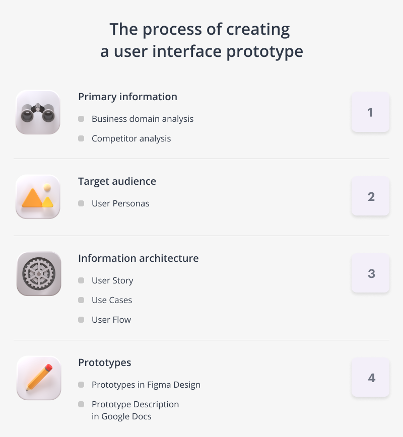
UX design is the process of creating a user interface that matches the client’s need for a specific action within the app. It can be divided into the following key stages:
- Collecting preliminary data
- Target audience research
- Information architecture development
- Development of prototypes
At first glance, one might think UX design begins during the prototyping phase. However, this is not the case. The basis for UX design is laid at the stage of immersion in the project; when we learn about the client and the specifics of his activities as well as the problem that he seeks to solve by creating an app. Understanding the UX designing process can help you form expectations about the set of artifacts and the quality of the results of the collaboration between analyst and UX designer.

#1. Collecting preliminary data
Screen prototypes are like the tip of the iceberg; there is a lot of work preceding prototype design.
Successful UX design begins with an analysis of the client’s industry. Understanding business processes help us understand when the ultimate goal has been achieved and what steps need to be taken to achieve this. Next, we study the client’s business, focusing on the requests and issues he came to us with, how we can help, and what needs to be improved.
Preliminary analysis cannot be done without competitor analysis. Based on this data, we will be able to:
- avoid design mistakes of competitors;
- see the advantages, chips used by competitors, and also think about how they can be improved and added to the product;
- understand our strengths and weaknesses compared to competitors.
#2. Target audience research
The next step is to define users. Without understanding who our target audience is, it is impossible to create a demanded product.

To define the target audience, we determine their demographic information (ex: age range, expertise, location, job title, hobbies, etc.), how they like to communicate, their lifestyle and attitudes. Such information helps us create a general portrait and split users into several typical groups.
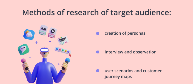
When researching target audiences, we use various research methods, such as the user persona method and the CJM (Customer Journey Map). Depending on the stage at which the UX research phase takes place, we choose the appropriate framework.
Typically, we collect information about the needs of the end users of the product directly from the customer. At the same time, we focus on the experience of working on other products as well as the results of point surveys of potential clients of the software product.
Sometimes we have the opportunity to conduct interviews directly with end users. For example, to develop a production management system (iFarm Growtune), we interviewed agronomists, growers and production directors.
The client’s industry, the client’s business and his target audience are the main objects of analysis. In addition, we look at trends, statistics that can help us, and we study cases from other companies. After that, we can move on to drawing up the User Flow, a diagram that represents the workflow or process from the user’s perspective.
#3. Information architecture design
Information architecture is the structural design of an information space that helps you accomplish user tasks and provide intuitive access to content. For simplicity, you can define an information architecture as a collection of logically related application screens. The information architecture can be in the form of User Flow or Screen Transition Maps.
Looking at User Flow, the team can immediately understand what the essence of the proposed solution is.
At this stage, analysts help clients describe business requirements and define a set of custom requirements for a software product. At Azoft, we usually define the scope of the product‘s functionality using User Stories, and we trace the requirements between the original (business requirements) and technical requirements (regarding security, performance, etc.) using Use Cases.
It turns out that Use Cases represent a set of technical requirements that are reflected in a set of interconnected sections, screens of the User Flow application. User Flow helps to understand the user’s path and see whether all processes in the product have a logical conclusion; whether alternative scenarios for using the functionality by the user have been taken into account. For more information on User Stories, Use Cases and other artifacts, see our article on clarifying requirements.
#4. Prototype design
After developing the information architecture, we move on to designing prototypes for the future app or website.
From a process point of view, at Azoft, it goes something like this. An analyst comes to a designer with an understanding of the app as a whole: what sections, modules or blocks should be provided in the app, what screens they consist of and what cases the user needs to close on each screen. Then the designer, based on information about the industry, the client’s business and his target audience, as well as the knowledge base on the project from the analyst, starts designing prototypes of screens. Figma Design is usually used as a prototyping tool. In the process of designing prototypes, the designer makes sure that the app design helps to achieve the user’s goal.
Chances are, if the UX design has been done well, you won’t even notice it. Looking at the product design, you will just intuitively understand where things are and what they do. You don’t need to dig deeper to understand how the app works. Of course, there are a number of exceptions to this unspoken rule, such as naturally complex systems or control panels.

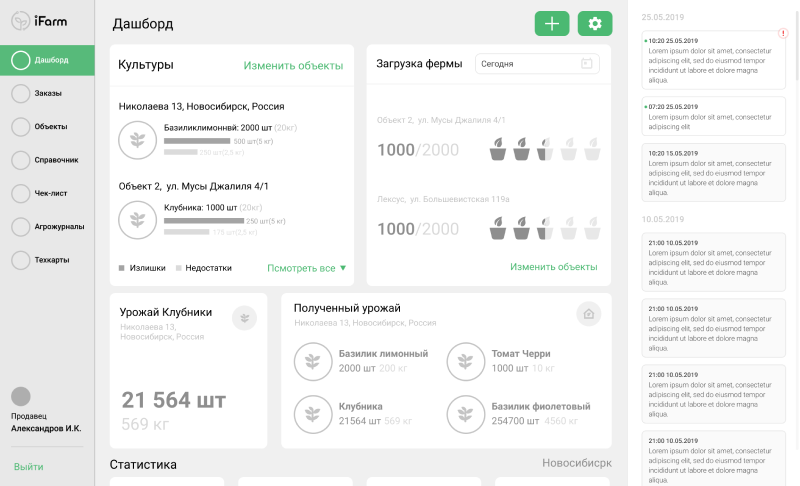
The example of a prototype for iFarm.
As a result of UX design process, focusing on your business goals and preferences, we will be able to make you a clickable prototype of your app in Figma Design and a description of all screen prototypes. These two things will allow you to start developing a product that is convenient.
UX deliverables
UX deliverables and artifacts help UX professionals communicate their product design ideas, research findings, and the context of projects to the team, client, and stakeholders during the app design process. With their help, the client and the development team get on the same page regarding the outcomes of the product, namely the result, purpose, and functions of the product. For each project, we select the exact set that is needed for a comprehensive description of the software product.
We’ll introduce you to the main UX deliverables that we provide at Azoft:
- Vision. It defines the boundaries of work and describes the core of “what”, “why” and “how”. Based on it, the whole set of artifacts is defined.
- Scope of tasks. The scope is a part of Vision. Tasks and assignees are determined in this document.
- Description of entities. As the name suggests, the document specifies logical relationships between entities.
- Diagrams. With them, analysts define processes, algorithms, relationships between entities, and other important concepts.
- Low-fidelity, high-fidelity and interactive prototypes. They are a sample version of a final product, which is used for testing before launch. The goal of a prototype is to define the main functionality and detect errors attest at an early stage.
- Description of interface behavior. This document is used to explain how the interface works, what rules exist, and how scenarios are processed.
- Non-functional requirements. These describe system attributes such as security, reliability, performance, maintainability, scalability, and usability.
- Visual design. The product design implies working on the corporate identity – choosing a palette of colors, fonts, stylistic design as well as patterns and decorative UI elements. It’s not just about “making things look beautiful” but an opportunity to define, or implement a brand color-scheme and affect usability with the layout, contrast, and visual hierarchy.
- User instructions. It explains how you can use the program.
Now you know how we design interfaces at Azoft. Are you interested in walking this path with us? Tell us about your project idea and we will help you with all stages of software and application development, from preliminary analytics to support and further development.


Comments