Mobile App Animations: 8 Main Types to Consider

IT copywriter
Reading time:
The simplicity and functionality of contemporary mobile devices represents a change in our concept of design. Touch screens displaced buttons and showed that even a primitively flat smartphone can be attractive. The popularity of smartphones and tablets evolved a new user interface appearance. And as a result, iOS and Android developers gave priority to interactivity.
This has influenced the development of mobile app animations: many moving elements appeared. These elements give us a feeling of interaction with real physical objects. Ideally, a user doesn’t even notice animations in the app, as they look intuitive and easy to use.
Animations are used in app UI design in order to simplify user interaction.
Perfect mobile app animations appear only where it is necessary. In order to create an app with animations, you need to understand what type of animations are better for each function.
From our experience in mobile development, we’ve identified eight main types of animations for mobile apps.
Mobile App Animations: Split by Functions
1. Visual feedback
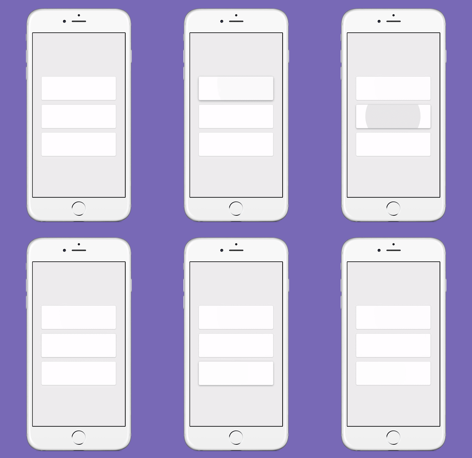
Visual feedback is the basis of animation in UI and UX design. It shows a user that an app reacts to their gestures. Let’s think back to any technical devices with buttons. For example, a TV remote control. When we punch it, we watch the switching channels and see that everything goes right. The same relates to any other interaction. Unconsciously we wait for a reaction from every object in response to our interactions with it.
If in-app buttons look pressed and change their colour while being pressed or a picture turns to the required direction, a user receives visual feedback. It means that an app is under the user’s control.
2. Navigation
Usually, users navigate inside an app using a menu with a list of app sections or features. Many apps have a complicated structure. In this case, animation works as a visual navigator. A user sees that a picture on the screen shifts while selecting or changing app sections. Thus, here we use animation to transport users reasonably between navigational contexts. It helps users learn how elements are arranged on the screen.
3. Displaying changes
Sometimes animations serve to present the transformation of specific elements in the app. A user controls the app and constantly interacts with various app elements – from buttons and menu bars up to photos, pictures, and graphics. It’s quite natural that app elements can change their view or even functions. For instance, when you tap a picture, additional information appears. If you add animations to indicate changes, it will engage users and enhance the adaptation to the elements transformation.
4. Monitoring app status
Users want to be in control and follow the processes that happen in the app such as uploading of documents or photos, sending messages, playing back audio and video files and many others. Animations allow demonstrating how the process works and to monitor the app state in real time. It provides a sense of calm and control over the situation. The product will benefit from mobile app animations that display the status of ongoing processes.
For example, an email app can show the process of sending emails. It’s quite well demonstrated in an animation with changing numbers.
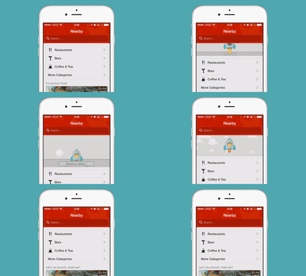
Another one example of animated app processes is widely known as “pull down to refresh”. This element is actively used in news apps in order to show users the updates in the newsfeed.
5. Structuring information
Animation allows structuring information via visual confirmation of the hierarchy of app elements. This is done as follows: an animation attracts users and shows what content to look at. Often this principle is implemented for a menu bar. Another illustration refers to the animations that demonstrate interaction among UI elements during in-app transitions.
Let’s imagine several elements on the main screen of the app. When we activate one of them, the app changes the picture and displays a whole app section. Animation helps users to know that it is the same element but with different form and scale.
6. Giving a hint
Visual hints help users use app elements properly. If you want to give a hint, you can highlight the key points in the app. For instance, active elements can be colored a specific color or moved when users tap them.
The following example is very illustrative:
Active elements are colored in green and have a flashbulb effect here. The user is able to easily learn the principle of how the app works using these animations.
7. Onboarding
Some apps have a more complex structure. If you don’t want to frighten app subscribers, you can explain to them how an app works at the very beginning. Animation is the best solution in this case. A user gets brief instructions about the app in a few seconds via animations. Usually, an onboarding opens up when the app runs. However, users should have access to the guide whenever they need.
8. Custom animation
Custom animation deserves special attention as it is created for specific apps. If your app includes custom animation, you can be assured that users will remember it. First off, unique animations can be so attractive for users, that they will prefer your app among many others. Second, custom animation helps to recognise brands.
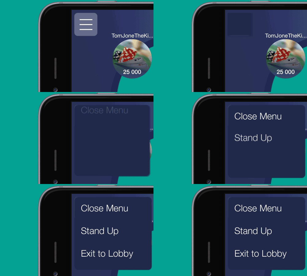
Here is an example of well-done custom animation – an app for playing poker. It includes graphics as well as unique transitions between app elements:

Still, an individually made animation is not always useful for the app. If the animation doesn’t look intuitive, or even feels annoying, it draws the user’s attention from the app features.
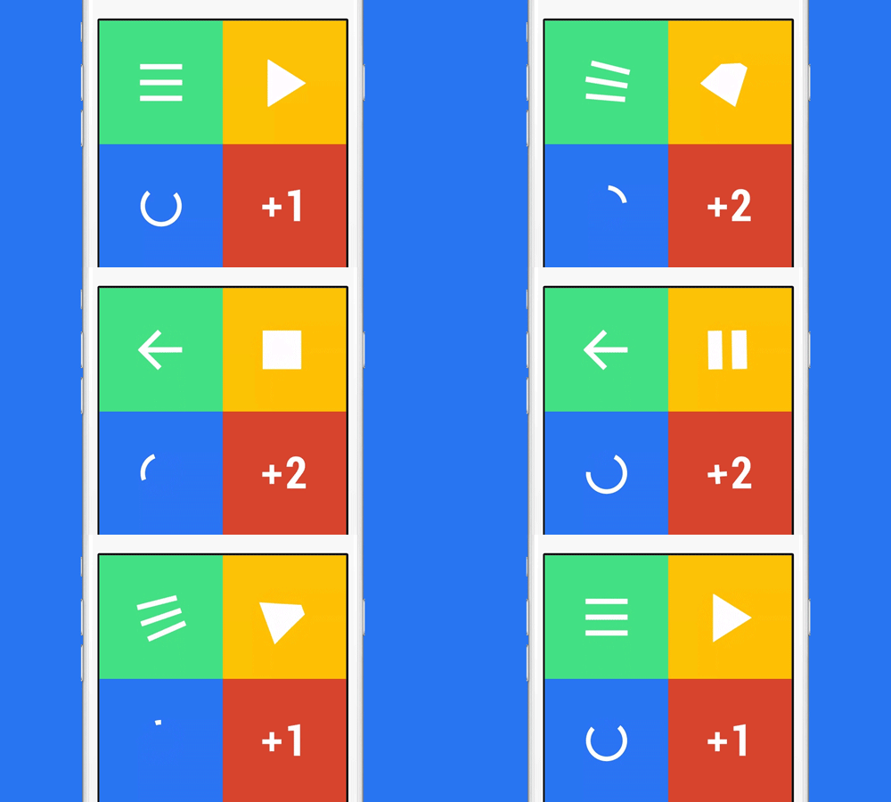
The best solution is having a reasonable balance. Unique animation can be unobtrusive and light if you use it as a nice complement. For example, you can animate particular app elements: arrows, loading or menu bar:
Takeaways
Above all, app creators should learn that animations have to be functional. In other words, make animations with purpose. A fun animation is nice but a second-rate issue for the app. In fact, animations are used in app UI design in order to simplify user interaction with the user interface.
8 main types of animations work in accordance with this rule:
- Visual feedback gives a feeling of physical interaction with an object
- Navigation facilitates in-app transitions
- Displaying changes helps to draw a user’s attention to specific changes (location of elements, appearance of additional information among others)
- Monitoring app status shows the current processes within an app
- Structuring information allows getting the hierarchy of elements and connections between them
- Hint can visually show how to use app elements
- In-app guide allows learning all the app features within the complex structure
- Custom animation gives a unique user experience and furthers brand recognition
If you use animations reasonably, your app will meet the trends in mobile design and help your brand to be visible and differentiated at the same time.


Comments