Reading time: 9 minutes
The use of animation in mobile apps is a must. Today, you can barely find an app without at least one animated object. Even the simplest, invisible-to-the-eye moving UI elements allow users to literally ‘touch’ an app. They improve the interaction with a product, which makes clients more loyal. In this article, we will share the main axioms of mobile animation so that you know how to attract, impress, and satisfy users.
The cornerstone of mobile animation
A well-designed mobile animation is one of the most powerful tools to create a quality user experience. It can contribute to the app’s success, make it stand out from competitors, and attract users. The majority of businesses that are reconsidering their mobile applications see this trend and try to use all the advantages offered by animation.
In-app animation helps solve the following problems:
- provide feedback in response to user’s actions in a mobile app,
- help the user get acquainted with the app,
- shows ways to interact with the mobile UI,
- attract and control user’s attention,
- make users understand that the app is functioning,
- provide information about the system status.
Adding animations to an app can be a challenge. A few poorly done interface elements can spoil the user’s impression of the whole product. Product owners who don’t consider the basic principles of animation when starting the development get apps that don’t meet the initial requirements. If you want the animation to solve problems, follow these rules. They will help you improve the UX design. Let’s dive into the key axioms of mobile animation.
Axiom #1: Follow the OS Guidelines
Every platform has specific recommendations for implementing mobile or web design and adding animations in apps. Developers and designers need them to ensure that their apps fit into the smartphone interface and look native. You can easily find them on the official websites.
Developer tip
Do not reinvent the wheel to build a good UI. The users of mobile devices follow the particular action logic of mobile platforms (iOS, Android, or Windows Phone). Thus, begin with the most common animations and be careful not to change things up more than necessary.
Axiom #2: Intuitive is Better than Unique
The main goal of in-app mobile animation is to help users without distracting their attention from the app content.
Animation works as a visual confirmation showing that an app reacts to user commands. In other words, users must understand how the app’s reaction corresponds to their actions. For example, when a user presses a menu button, the menu must appear.
If some elements of user interfaces live their own lives or have non-standard behavior, it can mislead and even irritate users. Users understand how objects move in the real world and expect to see the same on their smartphone screens.
Example
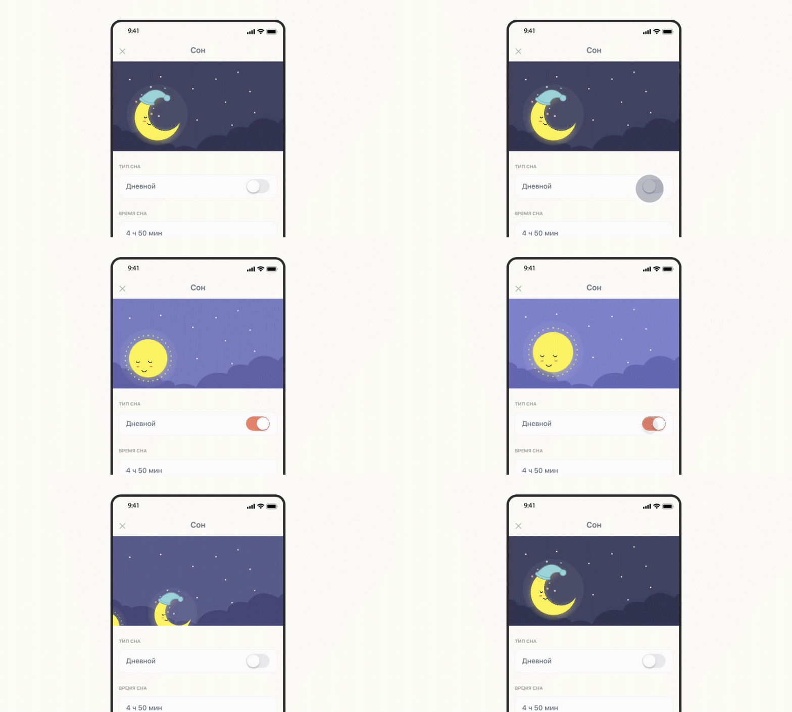
A good example from our previous work is the app Baby Pro. We created an interesting animation for switching day and night sleep. It shows that animation can be custom and intuitive at the same time:
Developer tip
Keep a balance between extraordinary animated effects and reality. App creators always want to add something special or unexpected to the interface. Animation is a perfect opportunity for it. By creating animated effects, you can manage user attention and inspire people to perform particular in-app actions. However, do not go overboard.
Axiom #3: Provide the Feedback
One of the key usability principles is a clear and understandable reflection of the status of the system. Good animation helps users understand what is going on in a particular app. We’ve all seen the spinning ring and the reversing hourglass that indicate loading time. They perform an important function: let the user know that the system is working.
Progress bars also serve as a feedback tool. This makes the interaction with the app easier: users do not think that something is “stuck” and don’t press the same button several times or restart the program.
Developer tip
Don’t complicate the process of interacting with the app by giving feedback for every user’s action. Use the standard set of tools and let your users get used to them. This will be enough for users to understand what’s going on and how to use the app effectively. At the same time, complex animation will not distract them from performing required actions.
Axiom #4: Animations Have to Be Meaningful
All animated in-app actions have to make sense. This means you should apply animations for targeted user transportation within the app: between navigational components, for showing the element changes when a user interacts with different app sections, for building hierarchy (hierarchy of images, music tracks, lists, and other things).
The animation draws users’ attention from one app element to another and influences the development of particular habits.
Example
One of our projects is an app for gathering interesting business contacts during international conferences. We implemented an appealing function with the animated effect of list paging, making navigation in the app easier. You can find a detailed project description on GitHub.
Developer tip
Use meaningful in-app transitions. Do not neglect the common hierarchical structure of the apps as it implies that during transitions a user moves in and out of app sections. You can implement it via similar animations. For instance, navigation in iOS devices implies that going deeper into the setting section moves you to the right, and going back moves you to the left. The user learns this effect and applies the same transition in other app sections.
It is very clear and consistent and creates a strong sense of place for where the user is inside the product.
Axiom #5: Feel the Rhythm of an App
Proper motion effects coincide with the app concept and have approximately equal speed. Otherwise, a combination of sharp and smooth transitions can negatively influence the perception of an app.
At the same time, it’s better not to slow down all the animations within the app to the common speed. Let’s say that pressing a button has to be not as smooth as paging the list.
Example
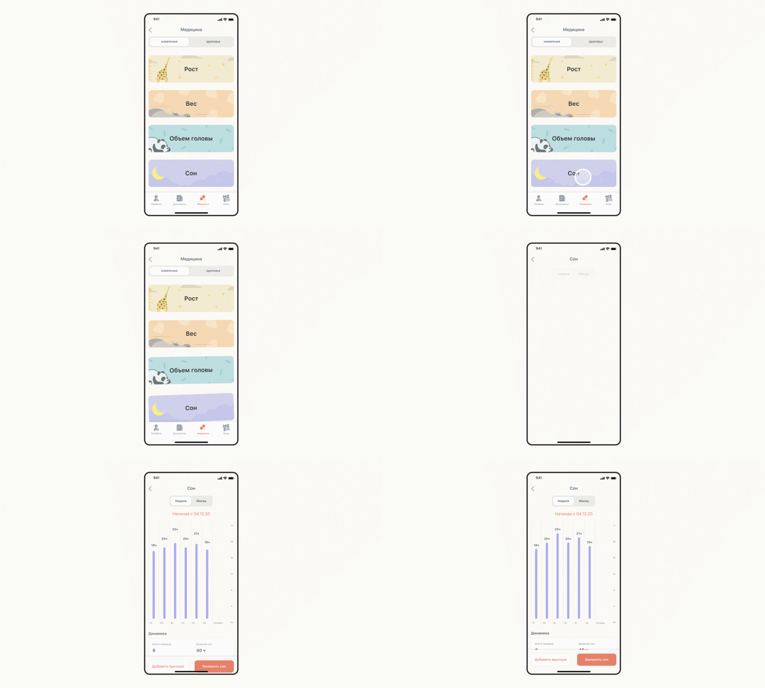
We developed a mobile app for tracking the growth of children. The app includes two custom visual effects: removing information from one screen and switching to another. Both elements have approximately the same animation speed:
Developer Tip
Monitor the time. Timing helps to ensure uniformity in animated effects. Set up a frame rate of every motion with approximately equal intervals. This allows you to smooth animated effects. User’s eyes adjust to the identical rhythm of in-app motion design. As a result, animated effects become more intuitive. Moreover, this works in favor of the second rule about clear animation.
Benefits and Pitfalls of UI Animation
Mobile animation has numerous undeniable advantages. Here are some of the benefits that will make your customers happy:
- the originality of the interface,
- clear feedback,
- the ability to simultaneously implement several functions,
- simplicity and speed of interaction,
- high usability.
However, there are some drawbacks too. You have to take them into account during app development to make user interactions with your product as comfortable as possible. When you work on animation, keep in mind that it can:
- increase the load speed,
- increase the amount of resources for development,
- become a negative distraction factor,
- lead to program crashes.
Find a balance between performance, beauty, and convenience. Your users will be grateful.
The Final Word
The lack of a good mobile animation can disappoint users and confuse them. This leads users to ask questions: is something not working? Have I downloaded an older version of the app? Should I look for a product that works as expected? Another issue is that product owners don’t always know where to use animation. One helpful tip to remember is: the idea is that “Less is more”. A beautiful and simple interface raises the positive perception and encourages clients to use the app again and again. Need help with a UI design for your app? Contact us, and we will be glad to use our best practices to improve it or help you make a new app from scratch.


Comments